Reference Source: https://www.supplychain247.com/article/what_is_ltl_shipping_and_why_is_it_important_to_corporate_america
Importance of Technology in the LTL Industry
In order to operate the LTL industry smoothly, technology comes in as a big help! Let’s take a look at the few advantages it offers.
Imagine how LTL efficiency will increase if the goods on a truckload need to travel in the same direction. A company, Flock Freight, earlier known as AuptiX, uses machine learning and automation which helps in algorithmic pooling. This technology smartly combines shipments from several customers who are on the same route (finds the best route) and unloads it into one truck.
Also, as per Flock Freight, it says that the shipment doesn’t leave until it’s delivery time which gives it time to add more products (if any) during the waiting period. This type of approach reduces the risk of damage by 21.2% compared to traditional LTL methods.
Reference Source: https://www.businesswire.com/news/home/20190808005115/en/AuptiX-Modernizes-LTL-Shipping-Industry-Algorithmic-Pooling
Mobile Applications
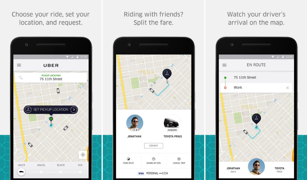
There freight apps that LTL sectors will benefit from – for example, Uber Freight and GoShare.
Uber Freight is an app that connects the drivers with shipping companies that have goods to move. During the two-month pilot, truck drivers left more than 10,000 reviews about the companies that use them to transport freight. It allows the truckers to choose the kind of cargo that they want to deliver and view the reviews and comments from other truck drivers about how the particular company is when it comes to communication, payment, etc.
Reference Source: https://www.businessinsider.in/Uber-Freight-is-helping-combat-a-1-3-billion-problem-that-the-trucking-industry-has-ignored-for-years/articleshow/67776734.cms
On the other hand, GoShare connects clients and drivers who are ready to transport the cargo. The clients can pay the drivers for their services through the app. They can also track the movement of the cargo in the app.
Apps that deal with LTL, can also notify the customers by updating them with real-time notifications, time definite requests, for instance calling the customer before delivering the goods. It can also give them visibility by allowing them to verify when certain shipment milestones are met and when a person needs to sign the confirm receipt.
Reference Source: https://www.rockfarm.com/clarity-ltl-notifications/
Artificial Intelligence-Based Pricing
Artificial Intelligence (AI) offers great potential for LTL shipments. XPO is the second largest provider of LTL transportation in North America. Mario Harik, chief information officer of XPO Logistics, said, “Our technology is spurring growth across all the services we offer. We’ve pinpointed four high-impact areas where we can lead the LTL industry in transforming traditional approaches to serving customers. Two of these innovations – dynamic route optimization and linehaul bypass – are already in pilot. Given our capacity for innovation, our opportunity for creating value in LTL is nearly limitless.”
Reference Source: https://news.xpo.com/en-us/news/1841/xpo-logistics-announces-four-new-technology-initiatives-for-ltl-optimization/
XPO has AI-driven pricing tools that help predict elasticity. AI companies are looking to understand historical data and emerging trends which will help them respond to customers faster and they are also looking to develop algorithms to forecast future marketplace conditions.
Robotic Process Automation
Companies are looking to incorporate cost-effective ways to categorizing incoming files. Manual labour takes a lot of time; hence, they are focusing on technologies that can streamline data. Polaris Transportation, a Canadian LTL company, focusses on cross border freight. It recently started using robotic process automation to streamline entering details about new orders.
The robotic process automation tool can handle about 85 percent of the customs process and the paperwork that comes with it, it also pulls system data from incoming emails. It saves workers 2-3 hours in a day.
Reference Source: https://www.ccjdigital.com/polaris-transportation-using-bots-to-automate-cross-border-freight/
Predictive Analysis
Improving pricing methods is another milestone that LTL wishes to achieve. XPO recently started using predictive analysis – it tracks how workers perform and then compares the output with the desired performance targets.
Incorporating the Right Features and Functionalities
Let’s take a look at few features and functionalities that would benefit LTL companies.
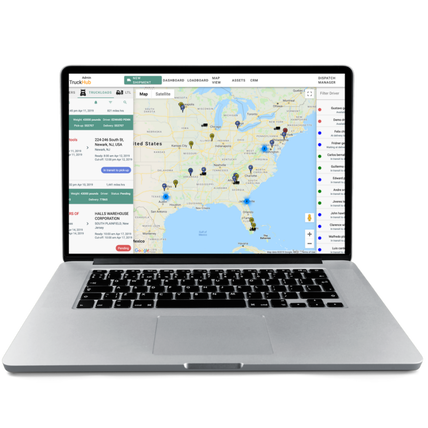
A Transportation Management System (TMS) with shipment planning functionality can facilitate logistics by automatically turning orders into shipments and determining the most suitable truck for their transportation.
A TMS system should have a shipment database that must include:
- Information on planned and actual shipments
- Orders
- Shipping details of products
- Individual products in those orders
Fleet Management
GPS technology should be incorporated in each product, so that the customer gets a real time view of when and how the package is going to be delivered. The company that ships their product will also be able to monitor the truck and shipment locations in real time, changes in shipment size and destination and the driver’s performance. Based on this information, they will be able to penalise the right people in case of any complaints.
Reporting and Analytics Functionality
The TMS system should have a reporting and analytics functionality:
- A dashboard should provide consolidated information about shipment statuses for managers
- General actionable reports should include carrier scorecards, distributional patterns, financial analytics and shipment trends which would improve the level of service.
RFID Technology
RFID (radio-frequency identification) technology can be used to manage logistics and inventory problems faced by LTL companies. RFID tag scanners automate the verification of sorting and pooling within a terminal which reduces delays, as it enables faster creation of waybills and delivery notes, ensuring smooth sorting of shipments.
To use RFID technology, an LTL carrier’s terminals need to have RFID readers and software installed and also implement tagging capabilities to tag new shipments and follow them through the LTL network.
Convenient Working Conditions
A feature-rich driver app would help retain the good staff in the company. The app should include:
- Advanced search and filtering which would enable carriers to search for and accept shipment requests in the nearby area.
- Route optimization that would direct the drivers the most optimal routes in a few taps – this would save you time and petrol costs.
- To eliminate time on tedious writing, implement a convenient check-in feature that automatically creates a QR code with a gate pass.
- When the package is delivered to the client, an e-signature would be the proof of delivery; drivers just ask the client to verify receipt by signing for shipments right on the driver’s mobile device. This allows recipients to sign faster, increasing drivers’ productivity and simplifying the delivery process.
- A driver dashboard should provide all details of a driver’s delivery history in one place, which include earnings and miles driven – consider integrating with management tools for accounting, payroll, payments, and time for transportation tracking.
Wrapping It Up
It is recommended that each freight company create their own app instead of using the off-the-shelf solutions. Sure, it saves time, but it does not work effectively.
For instance, a poor UX can make the application to complex for the user, which in turn requires experts to train the staff on how to use the app. Also, TMS vendors offer apps that have a standard functionality and your company would need to customize the app – purchasing the app and customizing it would come up to the same cost as making a new one.
Forward thinking businesses are giving these modern technologies a try so that they can benefit from the LTL business. If you wish to learn more about incorporating a system to help your LTL business, email the App Scoop Vancouver mobile app developers : https://app-scoop.com/contact-us.html


