Smart Scoping – Slow and Steady Wins the Race

​You’ve thought of an amazing idea for an app. You build it from scratch. It’s time to launch it. BUT you say, “No, it’s not completely ready; let me make a few alterations. I can’t launch an incomplete app.” Well let me tell you, it never will be!
Every successful app that was launched has never been completely ready for the users. Do you remember when Facebook first launched its app. It had so many limitations. Now, you can edit your pictures, upload videos as display pictures, use so many more emoticons apart from ‘Likes’ and even react with .GIF images. Apps like Facebook, Airbnb, Uber were not built in a day. There was a constant upgrading process that took place behind the scenes attracting more and more users. 
What is Smart Scoping?

Smart scoping is basically scaling down the original scope of your mobile app so that it gives you the chance to keep upgrading it and making it better. This doesn’t in anyway mean that you build substandard app that is not user friendly or serve any purpose.
Smart scoping, basically, helps you concentrate on your highest priority to achieve your business opportunity or to address the issues in your app. Your focal point should be at upgrading after your application, so as to achieve the best impact in the fastest time.

Some ways to smart scope your application:

  • Validate and invalidate the assumptions by gathering feedback to improve future versions
  • Identify the bugs and concentrate on the user-friendly aspect of the app
  • Track usage behavior
  • Gather real user feedback from actual app users

Limiting the Scope of the App

Smart scoping also involves limiting the scope of your app. This doesn’t mean that it should have any less features or usability restrictions; it just means that you need to gather the relevant feedback and then start working on it, one upgrade at a time.
Although the only time that you need to “de-scope” your app is in the following situations:

New Idea/Untested Market: Making an app that is absolutely new to the market means that you need to go slow and get as much feedback and user data as possible. For example, when Uber launched it was a fairly simple app that allowed the user to book a cab over the phone. Over time new features like ‘Rentals’ and ‘Out station’ (fairly recent) were introduced in the app.

Meeting Deadlines: If you have a deadline that you can’t miss, you need to limit your app instead of overloading it with features that are faulty. Features that have bugs have more of a downside than not offering the feature at all.

Budget: Budgeting plays a huge role in designing an app. You don’t want to overshoot the budget and land in a soup, would you? Hence, scoping intelligently and improving it step-by-step would ensure that you don’t overstep your budget.

Example of a Successful and an Unsuccessful App

Let’s take an example of two apps; one that succeeded and the other that failed – Hailo and Uber.
Hailo was a mobile app that you could use to hail a cab (the regular yellow cabs).With a 100 million funding it hit NYC in 2013; but so did Uber. Now, Uber was supposed to cater to a posh audience with their black car but what they did instead was that they introduced Uber X with really cheap prices.
Already hit with that aspect, Hailo further did not do their market research. Most “yellow” cabs in NYC don’t have a smartphone. Hence, reaching out to them and booking the cabs was becoming a problem.
If Hailo had smart scoped the project by investing less money on an untested market, they would have got real time user feedback and not invested more time and effort but instead could have come up with a solution and diverted their business model. But what Uber did was that they introduced high end cars and then changed their model, after gathering real time user feedback. This led to their success. So remember, “Uber wasn’t built in a day”, they smart scoped their app, leading it to success.
Reference Source: https://blog.placeit.net/apps-fail-teach-us-app-marketing/

So, what did we learn?

In the end, it all boils down to delivering a high quality application adds value to users, meets your objectives and that aligns with the budget and timeline kept in mind. Ensuring that you scope the project intelligently with logical milestones based on user feedback will help your application excel and widely used. Create a scope statement at the beginning of the project and concentrate on making an app that leads you to profit rather than bankruptcy and a failed effort.
A famous quote reads, “Half of being smart is knowing what you are dumb about”, which stands true in the case of even smart scoping your app!
 

Mobile App or Mobile Responsive Site

​Mobile optimization is becoming more and more trendy these days and it is no surprise. According to Mashable in August 2013, 17.4 percent of all global web traffic came through mobile devices and this number will continue to grow in 2014. So if you don’t want to lose your piece of the pie, it’s time to step into mobile world.
Now, if you are looking to expand your company’s presence on the mobile, would you consider making a mobile app or a mobile responsive site? Firstly, let’s understand the difference between the two! 
​A mobile app is a software application that the user needs to download to access data. Mobile apps can be downloaded on smartphones, tablets and laptop computers. Whereas, a mobile responsive site is designed specifically for smaller screens or touch screens. The user is able to access the website from mobile device’s web browser.
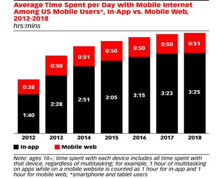
Now, let’s take a look at the data that explains to us the time spent by the user by using the mobile app and the mobile web. 
Picture

Reference source: eMarkerter, April 2016.

Through this graph, we can determine that the number of users using mobile app has been consistently growing; whereas the users using the mobile website has been stagnant. But before we come to any conclusion, we’ll need to take a detailed look at the differences between a mobile website and a mobile app. 
Mobile App

  • Can be handled on devices such as smartphones and tablets 
  • Is downloaded and installed in the mobile
  • Visit device-specific portals such as  Apple’s App Store, Android Market, or Blackberry App World in order to find and download apps for a given operating system.
  • Can be accessed without an internet connection
Mobile Responsive Site

  • Can be handled on devices such as smartphones and tablets
  • Is used through the web browser
  • Can display text content, data, images and video. They can also access mobile-specific features such as click-to-call (to dial a phone number) or location-based mapping.
  • Needs an internet connection
Which One to Choose?

Given a choice between the two, it is important that you decide what you need to choose depending on your end goal. For example, if you wish to make an interactive game, then it is best if you make an app. For example, it is much simpler to play Angry Birds on an app than on a website browser. Ideally, most mobile apps should have a mobile friendly website.

Advantages of a Mobile Responsive Site

If the goal is to market or boost public communication, a mobile responsive site is much more advantageous to help in your mobile outreach strategy.

Available instantly: The user can just click on the link to view the required content on the site; whereas the user needs to download the mobile app. There is a huge barrier between the initial engagement and the actual conversion.

Compatible across device: A website can be opened in an iPhone or an Android.

Mobile websites can be updated instantly: It’s much easier to change the design and content of the website. You can simply publish the edit once and the changes are immediately visible, whereas, in an app the user needs to install an update to use the new features.

Easy to find: It’s much easier to find a website than an app. It is much easier for users to find a website because their pages can be displayed in search results and listed in industry-specific directories, making it easy for qualified visitors to find you. 

Time and Cost: Mobile websites are much cheaper and easier to maintain and develop than an app.

Support and Maintenance: Supporting and maintaining an app (upgrades, testing, compatibility issues and ongoing development) is more much more expensive and involved than supporting a website over time.

Advantages of a Mobile App

Now let’s take a look at the advantages of a mobile app:

Interactivity/Gaming: An app is perfect for interactive games like Angry Bird, Pokémon, etc.

Personalization: Apps offer personalization, i.e. offering tailor made communication to users based on their interests, location and usage. Identifying the location, helps the application software to guide the user and offer him/her real time geo-specific content.
Procure data without internet connection: An app is also useful when the user needs to procure data on the phone without internet access. Let’s take the example of a banking app. The app has the provision to provide tax calculation, determination of loan limit, installment calculation, etc. without internet connection. Even though some mobile responsive sites allow you to access cache, you must know that they can offer very limited features.

Apps are Faster: Apps run faster than mobile responsive sites. Apps usually store their information on the mobile app which makes it faster for the user to access rather than using web servers, which sometimes have no connectivity or are slow.

Getting Notified: It’s much easier to get notified about the latest development or news rather than getting to know only when you access a website. There are two kinds of notifications: push notification and in app notification.

In app notifications are when the user receives the notification when he/she opens the app; whereas a push notification allows the software to send a notification which the users receive regardless of the activity that they are doing on their mobiles. According to a source, “There have been instances where the push medium of notifications has delivered click-through rates of 40%.”

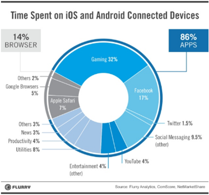
Users Spend More Time on Apps: As per Flurry Analytics, users spend more time on apps than mobile websites. It states, “Mobile users spend 86% of their time on mobile apps and just 14% of the time on mobile websites. Moreover, the average time users spend on mobile apps is also increasing. But a point to consider here is that users spend a majority of their time on gaming apps and social media apps.”

Picture

Reference Source: https://vwo.com/blog/10-reasons-mobile-apps-are-better/

Conclusion

The mobile app v/s mobile responsive site debate can be ended with a simple solution – the end goals. If your mobile goals are marketing driven and if the aim is to deliver high end content to the client then a mobile responsive site is the answer. On the other hand, if the user wants an interactive and personal experience then a mobile app is the solution.
One must also remember that it’s not always necessary that you’d need to choose between the two. Some businesses/companies could need both a site and an app; for example, Facebook. There are many users that log in from desktops as well as use mobiles to check regular updates. Hence, it’s not always supposed to be a debate. In the end, it’s all about choosing the right tool and expanding the horizon of your business. 

How Augmented Reality is Making Its Way into Mobile Apps

You don’t need to wait for a Hollywood director to make a movie that makes digital technology look larger than life. Augmented reality has already made way into our lives, slowly but surely, through digital apps! The best thing about AR apps is that they bridge the gap between the digital world and real world.
Do you remember the Pokémon augmented reality app that became a big phenomena? 

To explain in lay man’s terms, ​​the app developers put an overlay of digital data on top of real world objects. This was a marker-based augmented reality app.  These apps enable the software to pinpoint particular patterns when it used together with a device camera, i.e. a smart phone or a tab to overlay digital information over the real world. Hence, the players could see the different Pokémon’s sitting on tree tops or running in a garden or hidden in a restaurant. When the player pointed towards the Pokémon, they saw a virtual UI on top of the object. These kinds of apps can be used to create 3D imagery or even text over real time images.
There are also location based augmented reality apps which provide data on a specific location of the user’s devise.
 For example, Google Maps allows the user to understand his/her location and the road to their destination. This location based augmented reality apps also make it possible to know if there is traffic on the road and the fastest route to their location. Uber and Ola use similar technology to understand where their client is waiting for the cab and the client can also keep a tab on the whereabouts of the cab.
Some of the best augmented reality apps include Facebook, Snapchat, Sky Map, etc. Facebook and Snapchat allow live videos, filters of animals and also photo filters. Sky Map is an app that shows you the location of the stars when you hold the device facing the sky.

Future of Augmented Reality Apps

Originally developed or the Military, AR apps have been around for a long time. The potential of AR is vast especially in the education sector. We already have AR apps such Google Translate that helps the users to translate text into different languages. However, the only criterion is that the user needs to have some form of camera to overlay images on top of the real world. The future lies in getting over this barrier of 2D traditional computing.
According to the Wall Street Journal, Facebook’s Oculus, Samsung, and HTC Vive are looking to revolutionize the supply chain issues. This technology will allow supply-chain managers to make quick decisions, save on travel expenses and increase productivity. Imagine, if supply chains could have access to 3D representation of their factory floors. The Managers could inspect issues with immersive, virtual renderings of conveyor belts in overseas warehouses using a wearable headset.

 Recommendations of AR Apps

We bring you the top recommendations of free AR apps that you must download in your Smart phone and try them out for yourself:

Ink Hunter: Ink Hunter lets you try out pre-made tattoos, as well as your own designs, and they can be oriented in whatever position you like and placed on any part of the body. The app previously only supported black-and-white tattoos, but its latest update added support for color tattoos as well.

Quiver: Given smartphones are more tailored for adults than adolescents, the staggering dearth of AR content for children isn’t exactly surprising. Thankfully, Quiver (formerly known as ColAR Mix) works to bring your child’s 2D color books to life with animated images that spring directly from the Crayola-lined pages upon your kitchen table.

Augmented Car Finder: Augmented Car Finder is an app specifically designed to help guide you to your vehicle. Once the car’s location is set, the app creates a visible marker showing the car, the distance you are from it, and the direction you should walk to find it. It’s most useful for places like stadiums, convention centers, outdoor concert venues, and other crowded areas or those lined with massive parking lots. Users can also utilize the app to find their seats in large theaters and concert halls.

Amikasa: Amikasa helps you style your room and figure out your desired layout before you ever buy a piece of furniture. Using your iPhone or iPad’s camera, you can easily walk around your bedroom, kitchen, work office, or any other room you decide to furnish, and place 3D models of various items to see how they look, or to discover their ideal placement. This includes the ability to tweak the color, because maybe that cherry red chair suits the room better than the peach. The most recent update also added more kitchen faucets, cabinets, burners, and wallpapers, giving you even more options to design your perfect room.

Google SkyMap: Just point your phone upward when it’s reasonably dark and clear outside, and Google will point out all the different stars, constellations, and planets that are visible to your phone’s camera. It even allows users to search for specific stars and planets not presently visible on your screen. Once found, the on-screen interface and directional compass will then directly guide you to said star or planet even if it’s hidden.

Strategies that Top Brands Use to Engage their Mobile Users

​Being a top brand makes it mandatory for you to have your own application to drive engagement and get access to customers that generate revenue for your business. So, the most important thing is if you are giving your customers a good experience because word of mouth is one of the most used and effective marketing strategy to keep your customer base engaged.
Let’s take a look at 7 strategies that top brands can use to keep their mobile users engaged: 
Simplified Login Process for New Users

It is of utmost importance to create a simplified login process for customers. Keep the signup less complicated with basic fields or else the users are most likely to abandon the app. For example, Facebook’s sign up is a 5-step process; name, number or email address, password, date of birth and gender.
Once the user signs up, the app educates the users about functionality and features through gestures and actions while the customer uses it.

Notifications

With the advent of push notifications, you can increase customer engagement by targeting messages based on the customer’s behavioral and data preferences, for example, a discount or a sale on a particular product.
We must also keep in mind, that the customers like to be in control of the content that they receive on the mobile phones, so it’s important that the application has a ‘switch on/switch off notification’ option.  
Content is King

Your brand must implement lead nurturing programs that help you identify the needs, interests and actions of the customer. Audience segmentation based of in-app behaviors and demographics can also help monetize the company’s apps with better ROI.
For example, food apps such as Zomato has content for almost all restaurants with general information, reviews, menus and highlights. They also have live updates for the week, such as discounts and offers on certain days of the week. 

Rewards

Your content might be the best, but research claims that most customers sign up on the application to get discounts, coupons, special promotions and rewards. Giving these incentives to the user can go a long way encouraging customer engagement and boosting brand loyalty. Rewards can be given for the usage of the app or by providing special discount codes.

Social Media Engagement

Showcasing your content and announcing discounts or rewards can best reach your audience with the help of social media. Social media marketing can provide a huge customer base that interacts on a daily basis. Facebook, Instagram, Twitter, Pintrest and many other social media sites churn updated content on a daily basis.
Top brands can create engaging, personalized content by following the social media trends to attract their customers. The application can send push notifications that contain relevant content that makes the users engage with the app on a daily basis.

Make Sharing Easier

Incorporating social media apps in your application makes it easier for your user to share. You can make the user market your app by providing him/her benefits or reward points on sharing the application with a certain amount of users. When top brands make the app ‘share-friendly’, it’s easier for the customer to ‘like’ and ‘share’ on social platforms. Did you know, Instagram users have shared more than 30 billion photos and 3.5 billion likes per day? The reason is “because it’s that simple!”

Requesting Feedback

It’s important that regular feedback is taken from the user that is engaging with the application. Users that give you a higher score, Net Promoter Score (NPS) are your app promoters, whereas, those who score the app low are ‘detractors’.
The feedback form should only have relevant fields and should be easy to fill out. Listening to the users helps you improve the app store ratings and work on the feedback. Airbnb doesn’t only ask the person who rents the place to upload a review but also the person who is the owner of the place to write a review. The feedback given by both the parties ensures transparency and allows the user to make an informed decision. 

As we’ve understood, brand strategy for your application is an endless cycle. The customer’s expectations are increasing day by day as new apps, brands and social media strategies arise. The basic point that needs to be kept in mind is the customer’s benefit, seamless experience while using the app and easy navigation skills.
Listening to the customer, incorporating feedback and keeping your content up-to-date will help you withhold your loyal customers and draw new ones. So the questions is, are you now ready to entice your users and be the next top mobile brand?