How to Get Started?
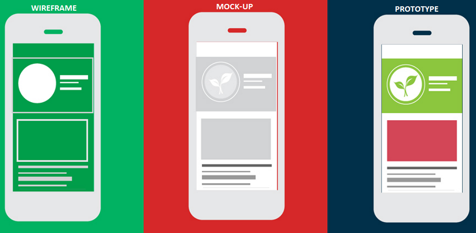
Wireframes are more of a messy structure of the app (without any design elements) that defines its core function. It needs to serve three purposes:
- Showcases the information displayed on the page
- Outlines the structure and layout of the page
- Describes the User Interface (UI) and the overall goal of the app
The wireframe should help you plan the layout and interaction patterns for your users without the fancy graphic details such as colour, copy, shading, etc. It is usually done in block and white. Although it will show where the images and text go, there won’t be any actual images, text, etc. Each wireframe element should be shown at true scale – as they are meant to focus the developer’s attention on the structure. It is exactly like how a car’s blueprint is made – it is to get a clear idea of the structure and placement of the parts in the engine without being distracted by its design.
Reference Source: https://www.invisionapp.com/inside-design/how-to-wireframe/
Another important aspect while creating wireframes is ‘Research’. Your research should include:
- Demographics of the users
- End product that will solve the user’s problems (i.e. meet user goals)
- Recognize the funnel or action that will help the user get to their destination page faster
- Making the overall experience easy and an enjoyable process
Creating Wireframes for a Successful MVP
Wireframes don’t need to include every microscopic detail such as page variation, page action, etc. but should give a big picture of the purpose of the app. It should be able to map out the user’s journey while using the app. The design should be easy for anyone to understand, even someone without tech knowledge of what a MVP will look like and how it will function.
Wireframing the Home Page
While creating a wireframe for the home page, the client/developer should be able to identify the app’s core solution. This will help build out the supplementary features that will be needed to support the core feature and boost the efficiency of the product in while. The wireframe allows the clients to go through all the possible actions that can be incorporated – a wireframe is nothing but a rough draft that is ready to be improved.
For example, if clients were to envision a food delivery app, its homepage would need to display a uniform set of features that will allow the user to browse through the food menu and choose food items. After instituting a homepage that shows different dishes, the clients would then be allowed to experiment with niche app features that can distinguish their product from the rest of the competitors – for instance, a feature that would allow the user to customize the food items or create food packages or opt for a monthly meal plan.
Example of a Successful Wireframe – Tinder
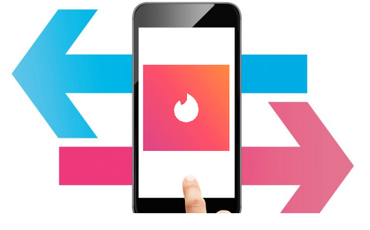
Now, let’s take a look at an example of a successful wireframe such as Tinder. How did this app make ripples in the app market? How was it different from any other matchmaking app? The striking feature that led to the app’s success was a simple fun play of swiping instead of a regular scroll button. In a scenario where we’re building sample content for any type of app, we rely on the user’s experience as a top priority that will determine which pages will hold certain features.
Reference Source: https://growthhackers.com/growth-studies/what-ignited-tinders-explosive-growth
Imagine Tinder without its swipe mechanism mentioned in its wireframe. It would just be a regular matchmaking app. All credit due to the co-founders, to keep in mind the core map of the app – swipe right and swipe left – during the MVP process, did it lead the app to be one of the top grossing apps in the Apple Store and Play Store. If this wasn’t mentioned in the wireframe, who knows if Tinder would have even survived its first year.
Tools That Can Be Used to Create a Wireframe
In order to make a wireframe, there are some tools that can be used. Let’s take a look.
It is designed to help you create you wireframes quickly. You just need to add the basic elements and then resize, position, and customise as needed. A simple version control will help you keep track of your progress.
WireframePro
It is a web based app, with a drag and drop interface to effortlessly create a wireframe. It comes with all the standard UI elements, along with a multitude of other components. The app also gives you access to the Mock Store, which offers a large selection of 3rd-party templates that you can either use for inspiration, or as a quick starting point for your own wireframe.
UXPin
It supports Sketch source files and Photoshop files. It also has a built in editor that supports CSS code snippets, allowing you to customise any element used in your wireframe. This gives a better understanding of the wireframe to the client.
Prott
It makes transporting the wireframe from the paper to the screen easy. You can photograph your sketches and import them directly into the app. These sketches can then be animated, or used as the foundation for your wireframe. Drag and drop pre-set shapes and UI elements directly onto your sketch to instantly go from shaky lines, to professional lo-fi wireframe.
Reference Source: https://www.infoworld.com/article/3199370/the-7-best-wireframing-and-prototyping-tools-for-app-makers.html
The Next Step Forward…
A successful app deserves its own unique feature by following the competing app’s uniform structure. While designing the app, remember that patterns cannot be disrupted, a user’s muscle memory should be taken into consideration during the wireframing process. If you want any assistance to create your app’s wireframe, please feel free to contact the App Scoop mobile app development team: https://app-scoop.com/contact-us.html.






1 Comment
bitcoin kaufen deutschland · March 5, 2022 at 1:00 pm
Pretty element of content. I just stumbled upon your website and in accession capital to say
that I get actually loved account your weblog posts.
Anyway I will be subscribing for your augment and even I fulfillment you get admission to
consistently rapidly. Bitcoin verdienen https://t.me/s/Bitcoin_verdienen
Comments are closed.